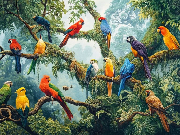
How to Use Color Theory in Bird Photography
Get ready to transform your photography with vivid colors that pop! Color serves as a powerful tool in photography, particularly in the vibrant realm of birding.
By grasping the fundamentals of color theory, you can transform your images from the ordinary to the extraordinary. This article delves into the essentials of the color wheel, highlighting the importance of primary, secondary, and tertiary colors, and how to apply these concepts effectively in wildlife photography.
You ll learn to choose backgrounds that beautifully harmonize with your subjects and employ editing techniques that enhance vibrant colors, enabling your avian captures to truly stand out. Prepare to infuse your photography with a captivating splash of color!
Contents
- Key Takeaways:
- The Basics of Color Theory
- Applying Color Theory in Bird Photography
- Using Colors that Look Good Together
- Creating Contrast and Depth
- Choosing the Right Background
- Editing Techniques for Enhancing Color
- Frequently Asked Questions
- What is color theory and why is it important in bird photography?
- How can I use color theory in bird photography?
- What are complementary colors and how do they work in bird photography?
- Can I use color theory in post-processing my bird photos?
- How can I use color to convey a mood or emotion in my bird photos?
- Are there any other tips for using color theory in bird photography?
Key Takeaways:
- Understand the color wheel and the different types of colors to effectively use color theory in bird photography.
- Utilize complementary colors colors that are opposite each other on the color wheel to make your subject stand out and create contrast and depth in your images.
- Consider the color harmony and emotional impact of the background when choosing a location for bird photography.
The Basics of Color Theory
Color theory serves as the bedrock of photography and artistic expression, looking into how colors interact, evoke emotional responses, and capture the viewer’s attention.
Understanding the details of the color wheel is essential for wildlife photographers like you, enabling you to craft images that exhibit striking contrast and color balance.
By skillfully employing various color combinations be it warm colors versus cool colors, vibrant hues, or the elegance of subtle monochromatic palettes you can elevate your work to new heights.
Understanding the Color Wheel
The color wheel is a stunning visual representation of colors organized in a circular format, revealing the intricate relationships between primary, secondary, and tertiary hues.
In this elegant structure, you ll see how the three primary colors red, blue, and yellow mix to create secondary colors like green, orange, and purple. These secondary colors can then mix with the primary ones to produce tertiary colors, expanding the spectrum into a richer array of shades.
Understanding this relationship is essential for your wildlife photography. It gives you the power to choose color combinations that enhance the visual allure of your images. By skillfully leveraging complementary and analogous colors from the wheel, you can accentuate your subject, capture attention, and evoke emotions that resonate deeply with viewers, resulting in truly compelling visuals.
Primary, Secondary, and Tertiary Colors
In the realm of color theory, you ll find that primary colors red, green, and blue act as the building blocks for creating secondary colors, which in turn give rise to tertiary colors.
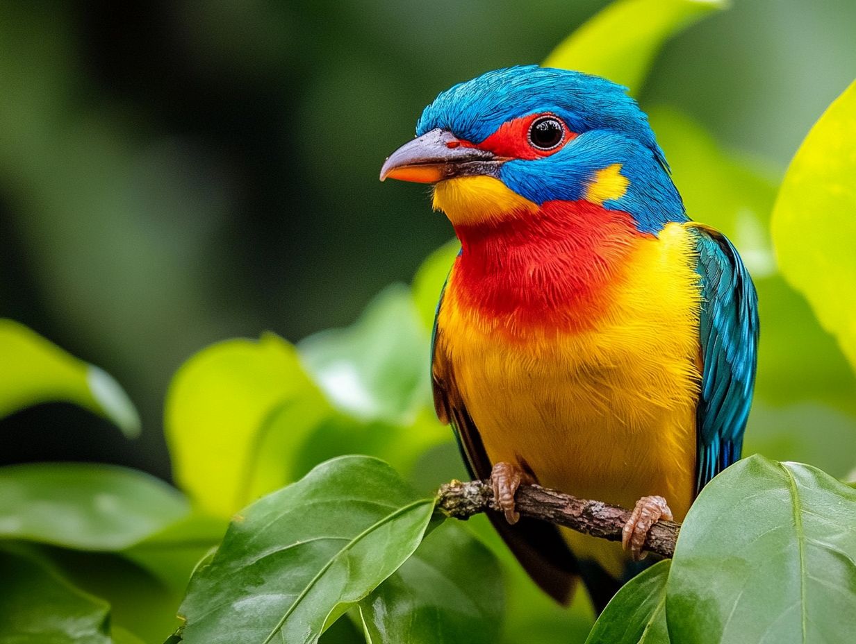
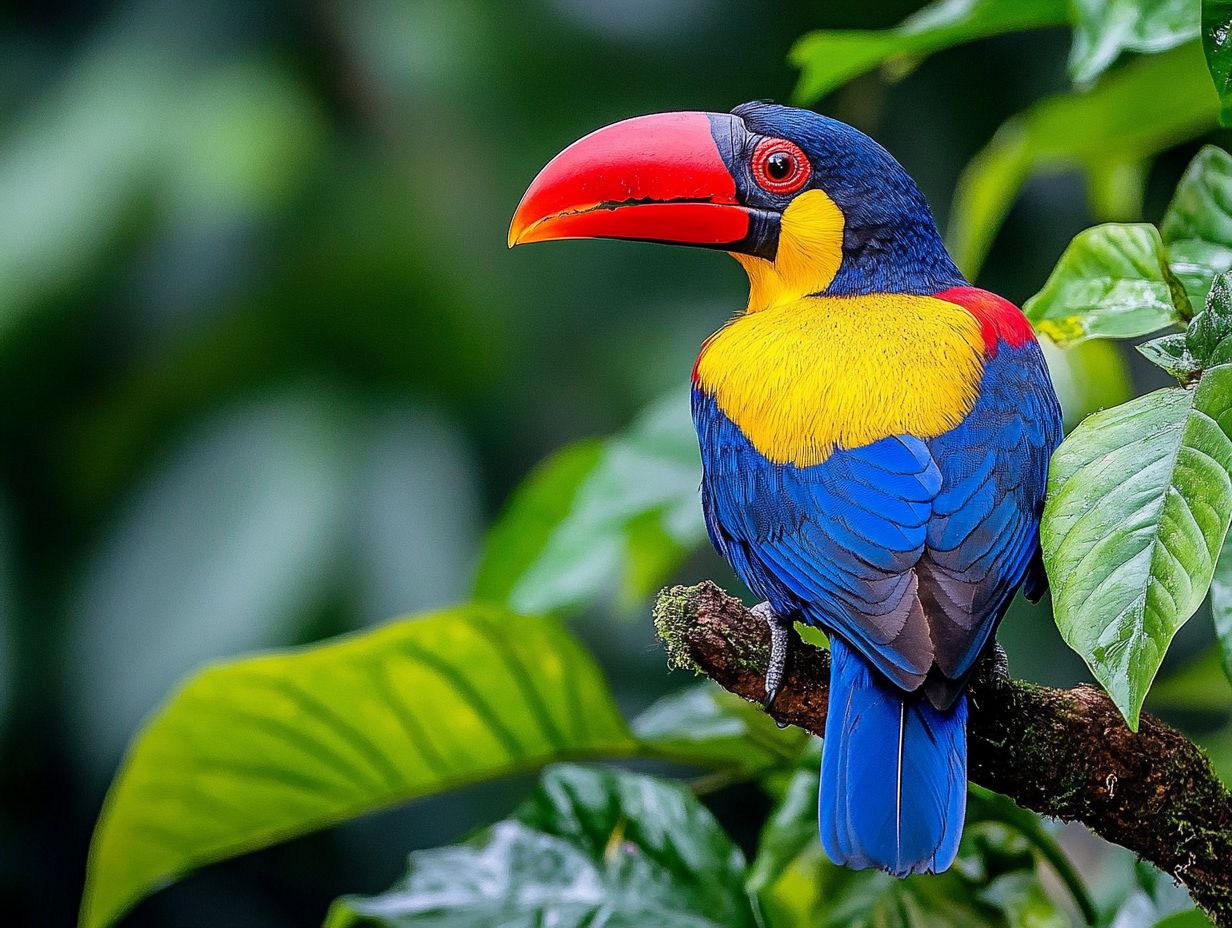
Understanding this intricate relationship becomes essential, especially in wildlife photography, where each hue can elicit specific emotions and weave a compelling narrative. For instance, when vibrant reds dominate an image, they can stir feelings of passion or danger, while soothing greens often symbolize growth and harmony with nature.
The interplay among these colors can guide the viewer’s gaze to the subject, enriching the overall storytelling.
By thoughtfully selecting and employing primary, secondary, and tertiary colors, you can craft images that not only showcase the beauty of wildlife but also resonate with viewers on a profoundly emotional level.
Applying Color Theory in Bird Photography
Applying color theory in your bird photography can profoundly elevate the emotional impact of your images, especially when you learn how to use natural light, fostering a deeper connection between the viewer and the subject.
By grasping the nuances of complementary colors and employing techniques that generate contrast and depth, you can thoughtfully capture the vibrant hues and intricate textures of avian subjects.
This approach supercharges the visual impact of your photos and adds a captivating atmospheric quality to your overall composition, enhancing the mood.
Dive into your next bird photography session and unleash the power of color today!
Using Colors that Look Good Together
Colors that look good together are dynamic pairs that create striking contrast. This elevates the emotional impact of your wildlife photography.
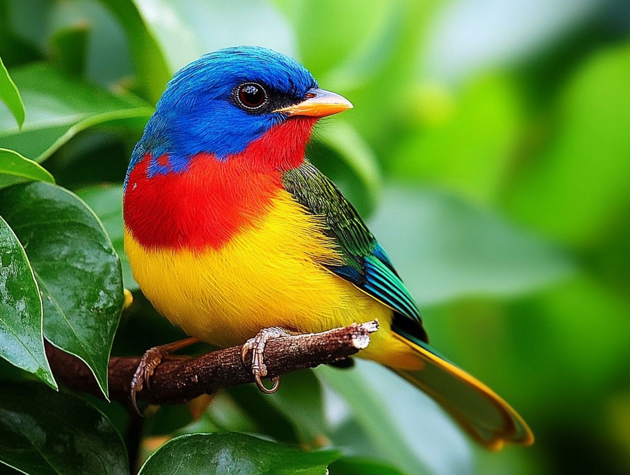
By skillfully using these color combinations, you can guide the viewer’s gaze to key subjects. Imagine capturing a stunning orange bird against a lush green backdrop what a sight! This technique highlights the bird’s beauty and conveys a sense of harmony within the natural world.
For example, capturing a blue jay against sunlit yellow leaves evokes warmth and joy. The bird’s plumage pops magnificently, especially during the golden hour the time shortly after sunrise or before sunset when the light is soft and warm.
Mastering complementary colors transforms ordinary images into captivating stories that resonate deeply with your audience.
Creating Contrast and Depth
Creating contrast and depth in your wildlife photography is vital for capturing the viewer s attention and evoking a captivating atmosphere.
Thoughtfully consider the placement of both foreground and background elements. By incorporating engaging foreground subjects, like leaves or branches, you enhance the depth of your images.
This guides the viewer s eye naturally toward the main subject. Achieving harmonious color balance is equally crucial; contrasting warmer tones with cooler shades adds dynamic visual interest.
Capturing images during the golden hour or blue hour the period just before sunrise or after sunset when the light has a cooler tone allows soft, diffused light to highlight textures and details. This imbues the scene with a magical quality, elevating your bird photography experience to new heights.
Choosing the Right Background
The right background enhances your subject and boosts the overall appeal of your photo. A thoughtfully selected background can blend seamlessly with the subject’s hues or provide a striking contrast that captures attention.
This profoundly influences the viewer’s emotional experience.
Considering Color Harmony
Color harmony is about creating a visually pleasing arrangement of colors in your photographs. This evokes a sense of balance and unity, crucial in wildlife photography.
In bird photography, achieving this harmony elevates an ordinary image into a captivating work of art. When colors complement each other, they guide the viewer s eye directly to the subject, forming an emotional connection.
For instance, pairing vibrant reds with soft greens can evoke a thrilling yet tranquil atmosphere. Utilizing natural color palettes that reflect the bird s environment enhances the visual experience.
Ultimately, these thoughtful color combinations do more than beautify your images; they weave a richer narrative about the subject and its habitat.
Using Color to Convey Emotion
Colors carry deep symbolism and shape viewers’ emotional responses in wildlife photography. Therefore, selecting hues carefully is essential for effective storytelling.
For example, vibrant tones like red and orange evoke warmth and excitement. These colors shine in scenes showcasing a bird with fiery plumage soaring against a sunset. Conversely, cooler shades like blue and green can create a sense of calm and tranquility, beautifully illustrated in images of serene water birds nestled among lush greenery.
By understanding color symbolism, you infuse your work with deeper emotional resonance, enabling your audience to connect with the avian subjects intuitively. When the right colors come together in a photograph, they elevate its visual allure and enrich the narrative woven through the image.
What s your favorite color combination in wildlife photography?
Editing Techniques for Enhancing Color
Editing techniques are essential for enhancing color vibrancy and accuracy in wildlife photography. They allow you to refine your images and achieve the aesthetic qualities you desire.
Transform your photos instantly by skillfully adjusting saturation and hue during post-processing. You can elevate the image quality and amplify the emotional impact of the moments you’ve captured in nature.
Adjusting Saturation and Hue
Adjusting saturation and hue in wildlife photography is crucial for enhancing visual impact. This ensures that colors truly reflect the essence of your subject.
These adjustments invigorate your images, showcasing the vibrancy of feathers or the earthy tones of a habitat. For instance, increasing saturation emphasizes the rich colors of a bird’s plumage, making it pop against a muted background. Fine-tuning hue helps correct any color casts, ensuring the subject appears just as it does in nature.
Techniques like adjusting specific colors enable you to isolate elements, transforming an ordinary snapshot into a captivating story. Ultimately, mastering these tools elevates visual quality and captivates your viewer’s attention, creating a more immersive experience.
Using Color Filters
Color filters are your secret weapon in wildlife photography! They dramatically transform the mood and atmosphere of your images while enhancing artistic expression.
By selectively adjusting hues and contrast, these filters highlight specific elements within the frame. They expertly guide the viewer s gaze to the subject in an engaging manner. For example, using a polarizing filter minimizes glare and boosts color saturation, making vibrant foliage and intricate wildlife details stand out against a clearer sky. Likewise, warming filters enrich the tones of a sunset, adding depth and warmth.
Explore options like red or yellow filters to create striking monochromatic effects or to enhance textures in animal fur. Whether you apply these filters on-location or during the editing process, mastering their use gives you the power to capture breathtaking imagery that resonates with the beauty of nature.
Frequently Asked Questions
What is color theory and why is it important in bird photography?
Color theory explains how colors work together and the psychological effects they have on viewers. In bird photography, understanding the basics of bird photography composition helps you create visually appealing photos that capture attention.
How can I use color theory in bird photography?
Incorporate color theory into your bird photography by using complementary colors for contrast or analogous colors for a harmonious look. Additionally, learning how to use composition to enhance bird photos can further elevate your work. Warm and cool colors can also convey different moods in your photos.
What are complementary colors and how do they work in bird photography?
Complementary colors are opposite each other on the color wheel, like red and green or blue and orange. When used together, they create contrast and make the subject stand out. In bird photography, this means placing a brightly colored bird against a green or blue background.
Can I use color theory in post-processing my bird photos?
Absolutely! Color theory can enhance the colors in your bird photos during post-processing. Use tools like color balance or saturation to adjust the colors and create a more visually appealing image.
How can I use color to convey a mood or emotion in my bird photos?
Color significantly impacts the mood or emotion in a photo. Warm colors like red, orange, and yellow create warmth and happiness, while cool colors like blue and green evoke calm or melancholy. Experiment with different color combinations to see how they affect your bird photos’ overall mood.
In conclusion, mastering color editing techniques enables you to create stunning wildlife photographs that stand out. Apply what you’ve learned and let your creativity shine!
Are there any other tips for using color theory in bird photography?
Pay attention to the background and surrounding colors when photographing birds. A busy or clashing background can distract from your subject.
Choose backgrounds that complement the bird s colors. Don’t hesitate to experiment with different color combinations; you might discover something amazing!